Zimmer Biomet
Led website redesign and research for a $26.2b medical technology company.
Design Lead and UX Researcher
2020 – 2021 / 10 months

Methods
Design System Development
Prototyping
UX Research
Usability & Concept Testing
Challenge
Zimmer Biomet, a $26.2b medical technology company operating in 100+ countries, engaged us to redesign its website, evolving its brand image towards a more tech-forward narrative and improving the digital experience to better serve medical decision-makers, from surgeons to technology and business leaders.
I joined the project halfway through, tasked with developing a design system for over 700 products. I uncovered critical knowledge gaps about surgeons' decision-making processes, which threatened the success of the project and their marketing pushes around connected surgical ecosystems integrating AI and real-time patient data. What started as a straightforward redesign evolved to deliver richer insights for teams beyond UX, including sales and marketing.
Outcome
I optimized usability testing to close critical knowledge gaps about our audience's needs and delivered richer insights around key business areas like medical education and connected surgical data systems. This helped guide positioning and marketing efforts for several product teams, impacting over $50 million in sales, marketing, and equipment contracts across several product categories with healthcare systems and providers worldwide.
We delivered a complete website redesign and component-based design system, defining a new collaboration process with the development team that reduced time and effort on annotation and exporting to Jira by 40%.
Team
I was the design lead for this project, managing a visual designer and our collaboration processes with development, content strategy, PM, web migration, and client teams.

The old website’s homepage


Testing via Zoom using a clickable prototype in Figma
Process
The design process included 6-week phases for design and development iterations, where we’d work on mini-discovery with product and marketing teams around different sections of the site, audit content, and build templates and components to suit different needs.
Once we’d completed the foundational pages, I developed a plan for usability and concept testing to evaluate the visual design, information structure, and interactions. I also added discovery questions to gain more information on real-world processes and mental models we hadn’t collected during initial research.
Study Questions
Does the way the page is currently structured guide people to the right information & resources for their goals as efficiently as possible?
Does our naming for sections and labels match what our users are looking for and what they think they would find there?
Do people understand the Smart Orthopedic offerings as they appear throughout the experience across Specialties and Product pages?
Methods & Tools
Moderated testing: To get qualitative insights on the experience and design
Terminology test (pre-moderated test): Test people’s understanding of navigation terms pre-test
Figma prototype: Increase the fidelity of interactions we could prototype
Note-taking in Figma + Rainbow spreadsheet: Capture contextual observations + quickly codify patterns
Participant snapshots: Provide added context around mindsets and processes and sneak in rich qualitative insights
Collaborative synthesis: leveraged broader team’s knowledge and provided inspiration and new ideas
Test Plan
Our testing focused on critical utility pages that inform surgeons' and health professionals' decisions. With 700+ products, we aimed to validate our information structure and labeling across products with varying complexity levels, balance marketing messages with detailed product and supplementary information like PDFs and videos, focusing on key areas like category pages, product pages, the navigation, and new tech-focused product lines integrating surgical hardware, software, and consumer tracking apps.
We started out with two significant hypotheses and critical needs to test:
Hypothesis: People won’t understand branded jargon & terms.
Approach: Before the test, we sent people a terminology test to ask participants to provide their thoughts and impressions about navigation headings and potentially confusing terms before starting the usability test. This allowed us to show our client teams what people thought using their own words so they could factor this into renaming sections altogether, adjusting copy, or rethinking product line names.Hypothesis: We're missing the fuller picture of how people’s processes actually work in real life.
Approach: I reserved the first 15-20 minutes for qualitative interviews so we could ask deeper questions about their real-life processes, decision-making criteria, and their surgical ecosystem: who else they needed to work with to make decisions. We suspected few surgeons would be making these important decisions alone and confirmed they need to inform and convince various stakeholders in procurement, technology, and business roles when making purchasing choices.

The Terminology Test provided insight into how well different terms matched with people’s mental models versus what they’d find on the related page.

A ‘participant snapshot’ adds context and details to quotes, capturing real-life processes and needs without relying on eloquent, soundbite quotes alone.
Prototype
I used Figma for prototyping, offering richer interactions than InVision while being more lightweight than Principle or Framer. I learned more advanced Figma prototyping techniques to accurately represent the interactions, including clickable anchor links on menys and scroll effects. For each test, I copied the prototype to track notes visually, using color-coded digital sticky notes for different types of feedback. This approach made synthesis and sharing with team members easier later on.

Anchor links created in Figma allowed people to click naturally on any part of the prototype they were drawn to.

Test Measures
Our testing strategy combined quantitative measures (task success scales, ease ratings, and post-test questionnaires) with qualitative insights from think-aloud protocols, follow-up probes, and open-ended feedback to continue building our understanding of target audiences.

Calculations sheet divided between Alpha and Beta tests

Note taking in Figma to capture sentiments and comments
Prototype Changes Mid-Test
We realized four tests in that a couple of our design patterns and hierarchy issues on the Specialties page – which collected all products a surgeon might be looking for to solve a patient’s specific surgical needs – led to a nearly 100% failure in completing tasks. Based on this, we made swaps with other design system components and increased success and satisfaction rates:
Redesigned a product collection component to simplify information while showcasing the breadth of related product offerings across other Smart Orthopedic specialties (connected data services, robotics, and other surgical equipment
Reimagined our anchor links to make clickability clearer
Increased font size in the Filter section

The interaction patterns for the “Smart Orthopedics” section, which highlighted related products and technologies in different areas, proved confusing and overshadowed product filters. Swapping the component reduced confusion and improved comprehension of the offerings and how they related to this section.
Synthesis & Analysis
Democratizing Insights: The Rainbow Spreadsheet
To bring more people into the sense-making process, I took key observations and coded them into a rainbow spreadsheet, which visualized the prevalence of different observations. I also added feedback-type emoji indicators to capture sentiment at a glance and numerical codes to count the frequency of test issues to prioritize our design iteration process.
Through this visual approach, I worked with the visual designer and content strategist to discuss findings, develop recommendations, and share video clips to help inform other teams' decisions and spark ideas for potential new projects to pitch to our clients. I also pulled quotes or insights relevant to our content strategists’ needs into another tab of the sheet to support his work.

Structuring Recommendations
The site’s design and usability were well-received overall. We discovered some issues around hierarchy, confusion around terminology and the Smart Orthopedics story, and thought of new ideas to discuss.
I developed page-by-page recommendations for each of our test sections that highlighted the performance metrics and divided the recommendations into two categories:
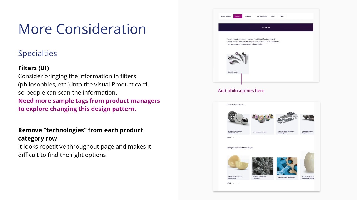
Do Now: immediate actions we could take to improve the design, which were typically revisions to things like the UI and information hierarchy
More Consideration: things that required more discussion or information with product owners or teams, which often fell into the category of messaging and developing tangible proof points through things like case studies or videos


Delivering Additional Value: Strategic and Narrative Insights
As part of the study design, I also delivered additional insights into user behavior and decision-making processes to shape business and marketing choices around areas our client had identified as priorities or investment areas, like high-tech Smart Orthopedics and Education. These insights were divided into two categories:
Section and Page Insights: Additional quotes or facts that helped our team and clients understand the what and why behind people’s approaches, thought processes, decision-making, and personal philosophies or their mental models around marketing terms
Participant Snapshots: Brief summaries related to topics our clients cared about to enrich their understanding through short narratives, like perspectives on education or their consideration criteria for adopting new technologies
With the lack of robust primary research up-front, these pieces helped our clients better understand users of their products and provided food for thought as they worked through new business plans and messaging during the reorganization.

Section/Page insights page with quotes from several participants

Participant snapshot on new technology
Outcome
Design System Development: Reshaping Design-Dev Collaboration
For our design system, I used Brad Frost's Atomic Design approach and Smashing Magazine's guide to rethink our process and dev collaboration. To streamline documentation, I proposed managing the system in Figma and embedding files in Jira as our source of truth. This eliminated the need for manual Jira documentation and PDF exports.
Our new component library in Figma included links explaining variations and interaction patterns, plus a notes section for tracking progress and approvals. This approach saved hours per design and sparked a collaboration with the dev team to templatize the system for future projects. As a bonus, it served as a reference for the whole design team.

Design system landing with linked contents

Overview of the Atomic Design process from Brad Frost

Our design system also noted perceptual patterns like the visual design theme for the page, as we applied different color and visual treatment themes to different pages.

Page template labeled with components and details for the developers and migration team

Tags helped us track which components were ready to code with finished specs, and which were still in progress.
Outputs
Implementing Insights: A User-Centered Redesign
Our content recommendations and terminology insights were taken to heart and implemented as part of the redesign. Smart Orthopedics was renamed and the first row of content under the header features peer proof points with video testimonials from surgeons, rather than marketing language.

The redesigned Smart Orthopedics page centers what we heard in usability tests: real evidence that shows how surgeons can be smarter, faster, and better instead of marketing language and more, shorter videos

The old Specialties page hide information in dropdowns with long lists of text links

The revised Specialties page introduced anchor links to help people navigate uses product images to help people navigate through visuals instead of product names

The old navigation

The revised navigation with clear categories, which also surfaces higher-tech products the company hopes to introduce more surgeons to

The old Product page.

The revised Product page brings key information like surgical philosophies (approaches) and clinical success measures to the forefront.
Impact
Through a mixed-methods research and testing approach, we gleaned richer findings impacting the organization beyond the project team, which we wouldn’t have with quantitative–focused usability testing alone.
We also uncovered critical gaps and challenges around how multimillion-dollar lines of business were understood, which helped inform several different product team's strategic plans, including rebranding, marketing, and sales strategies.
Using people's words and experiences, we showed what people actually thought of marketing jargon and current content to help marketing teams make evidence-based decisions.
Our insights on Education also sparked excitement around revisiting a proposed learning management system redesign project.
I presented this as part of our Design Research Ops training to introduce our team to approaches and methodologies around usability testing, especially exploring lighter–weight documentation and reporting methods that could integrate into Agile processes. View the presentation here.
Key Learnings
I wanted to use this process to determine how to incorporate usability testing into our projects more easily. Research and testing were often left out of projects, so I prioritized coming up with lighter-weight methods to collect and synthesize information and share broadly with other teams.
Working as a team of one, I consulted a few different books and resources to adapt different methods, like Tomer Sharon’s Rainbow Spreadsheet. I also brought other team members across functions into the analysis process, which helped inform their work and expand understanding of their roles in content and visual design for this project.