Universal Insurance
Making home insurance easier to understand
UX Designer and Researcher
2018 / 4 months

Methods
Workshops
Competitive Analysis
UX Audit
Field Interviews
Information Architecture
Wireframing
Interaction Design
Context
Universal Insurance, a national home insurance provider with over 800,000 policies in 17 states, approached Agenda NYC to develop a new brand strategy and redesign their consumer and investor websites to better serve clients and stand out in a saturated Florida home insurance market.
Outcome
Three redesigned websites that help people navigate complex home insurance processes – such as filing claims and understanding policies – with ease.
My Role
UX Researcher and Designer with a design director, content strategist, visual designer, account manager, and studio president.

Redesigned site for Universal Insurance Holdings, the investor-focused website
Process
One week of on-site workshops based on the design sprint methodology to bring together disparate stakeholders and introduce them to a design-first approach
Competitive & comparative analysis to survey the insurance landscape and gain inspiration from adjacent digital product & service innovators
Field interviews with insurance agents, employees, and policyholders to understand processes, reasoning, and decision-making processes
Content audit & mapping to inform site & page structures and components, based on the needs of different people (policyholders, agents)
Prototyping to demonstrate proposed interaction patterns across different concepts
Research Questions
We needed to make home insurance policies and processes easier to understand and to bring the personal experience through in our redesign. Our UX areas of focus were:
Painless processes: how can we make the sign-up and claims processes easier to navigate & understand?
Education & empowerment: how can we provide people with just the right amount of information when and where they need it during the process?
Value & recognition: How might we convey our value and better serve our current and future customers and partners?
Research
Workshops
Before flying down to Florida, we assembled a series of design and discovery workshops based loosely on Google Ventures’ Design Sprints. Our schedule alternated stakeholder & employee interviews with activities including journey mapping and a collaborative design studio where our clients could bring their expertise into sketching potential solutions.

Getting ideas out on paper through design studio sketching revealed hidden processes and information that helped us refine our interview questions.

Competitive & Comparative Research
Competitive research showed users frequently opted for large, multi-line insurance companies that provided cheaper, bundled rates and a sense of trust due to name recognition. “Insurtech” startups like Lemonade also posed a threat by offering quick, simple signup processes and making home insurance feel approachable. Home insurance customers seemed to be shifting more towards self-service processes that eliminated insurance experts like agents.


Feature and experience comparison
Proto-Personas and Inciting Events
We developed proto-personas as part of a client workshop to create a shared understanding of the people we would be designing for and refine our field interview topics. Universal’s consumer site primarily served current and future policyholders at either end of the tech literacy spectrum, as well as agents who could use the site's resources to build stronger relationships with their clients.
Policyholders: concerned with understanding their coverage options or navigating the claims process in case of damage.
Agents: needed easy-to-find information to help their clients and resources to grow their business, especially for junior agents.
Employees (such as Adjusters): needed ways to help people prepare the right materials to help with their claims and minimize calls, visits, and faxes so they could help people rebuild faster


What incites the need for a new home insurance provider, how people research their options, and how they manage their policies on a regular basis
Field Research and Interviews
We interviewed policyholders, agents, stakeholders, and employees to learn about their thought processes around choosing insurance and the unique brand values we could translate through the redesign. Despite a crowded market for home insurance in Florida, people recognized Universal as a company that put people first thanks to its customer service and innovations, such as a rapid-response Fast Track claims team, which got people their first check to rebuild in 48 hours.
Policyholders (or even their neighbors) would come up to gush to adjusters wearing their red elephant logo hats about how the company helped them rebuild.
Agents trusted them as an insurance company that had–quite literally–weathered every storm over the past 20 years. Other companies collapsed when major disasters struck, creating customer service crises and damaging people’s trust in their agents.
“When I go out and have my red elephant on, people recognize it.”

A visit to a local agent’s office brought to life the saturated insurance market in Florida & indications of how Universal might stand out.
Synthesis & Analysis
Key Insights
People knew they didn't understand home insurance but didn't necessarily trust the information they found. They expected companies to care more about saving money than helping customers in times of crisis, felt highly emotional after catastrophe struck, and couldn’t comprehend policy details or complicated claims processes.
Form factors for service & information matter even more during a crisis. When people need to refer to important policy details and documents while filing a claim, the resources they found were presented in “PDF graveyards.” These can’t be easily accessed on mobile devices when they’ve lost power after a storm and add to frustrations and delays.
People valued a personal, human touch – and that's what Universal was known for. Seeing our client’s mascot on a truck or shirt stirred an emotional association in people – they would come up to employees and tell stories of how the company had helped them or a neighbor to rebuild their lives after their homes had been damaged or destroyed.
Design Principles
Transparency & simplicity are key. Helping people understand information and claims processes on their own, without the need for expert translation or a phone call, would build trust in Universal.
Be a resource. Sharing the expertise Universal has built over 20 years would create value for customers and highlight their stability in the industry.
Highlight the human side. Universal was known for its service and care, so we needed to bring that feeling through the redesign.

Outcome
Identity & Design Language
We brought the key brand messages and differentiation points front and center on the home page, along with actions, reflecting Universal’s more open and friendly brand image and using recognizable colors and symbols (red and the elephant).

The old homepage

The new homepage
Resources for Understanding Insurance
We aimed to present complex insurance information in an engaging, easily navigable format, moving beyond the typical blog posts or information dumps used by other providers. Our research showed that people sought information based on specific life stages (like new homeownership) or circumstances (such as post-storm repairs), and we needed different types of resources for agents and policyholders.
We designed Resource pages that guide users through information tailored to their unique situations, leveraging our client'’ expertise to make insurance concepts more accessible and relevant.

We recommended developing resources for both policyholders (understanding insurance) and agents (understanding what Universal had to offer), including an insurance terminology dictionary to demystify policy terms and documents.
Filing a Claim: Transparency & Simplicity
We provided upfront information about what people needed to get through the claims process – like policy numbers and photos of damage – so they could complete the claims process without interruption. During high-stress moments like the emotional experience of experiencing damage to or loss of one’s home, we needed to make processes clear, simple, and quick.
We reduced the number of clicks to reach the “File a Claim” form from six to two and ensured it was accessible on mobile devices, something especially important for people who might only have access to their phones after a disaster.

The old claims form was completely inaccessible on mobile, presenting challenges after disasters.

The revised Claims page.

The old process required six clicks just to get to the form from the homepage.

The revised process provided necessary information up front and got people started in two clicks.
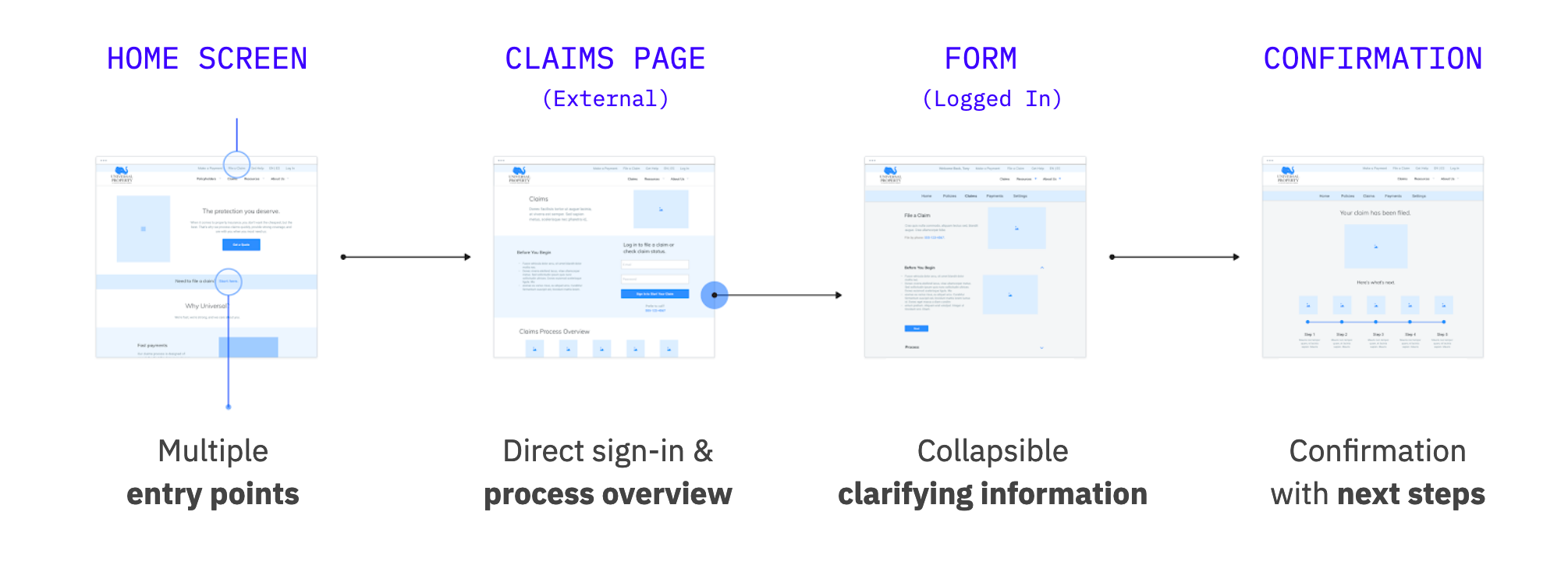
We provided multiple places for people to find the form and added clarifying information during and after form submission.
Impact
Our stakeholders started to refer to the personas by name during our sessions at the end when discussing different content and strategy options, advocating for Glenn's (current policyholder) or Casey's (a new agent) needs.
After returning to New York, the C-suite team reached out to express appreciation for the impact the workshops made on their team and company as a whole, teaching them how to empathize with their customers on a new level and apply strategic design thinking to larger restructuring efforts within the company.
Our work also won us a new contract to develop the brand identity, experience strategy, and design for an educational insurance site, Clovered. I helped with research and UX design for the site.
